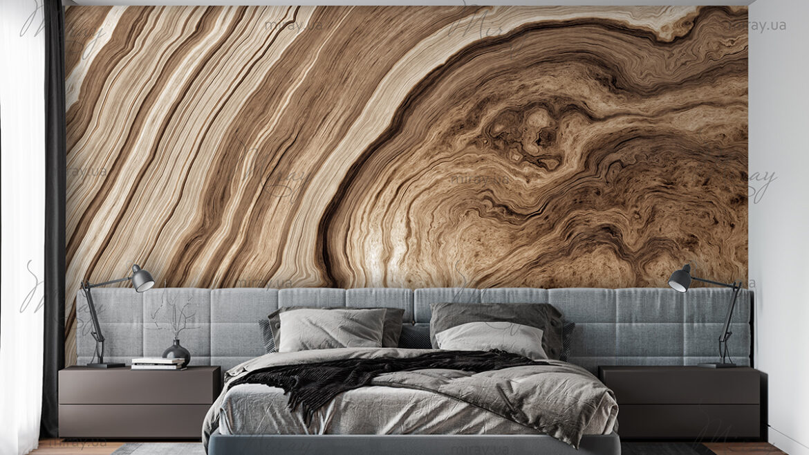
Correct color scheme
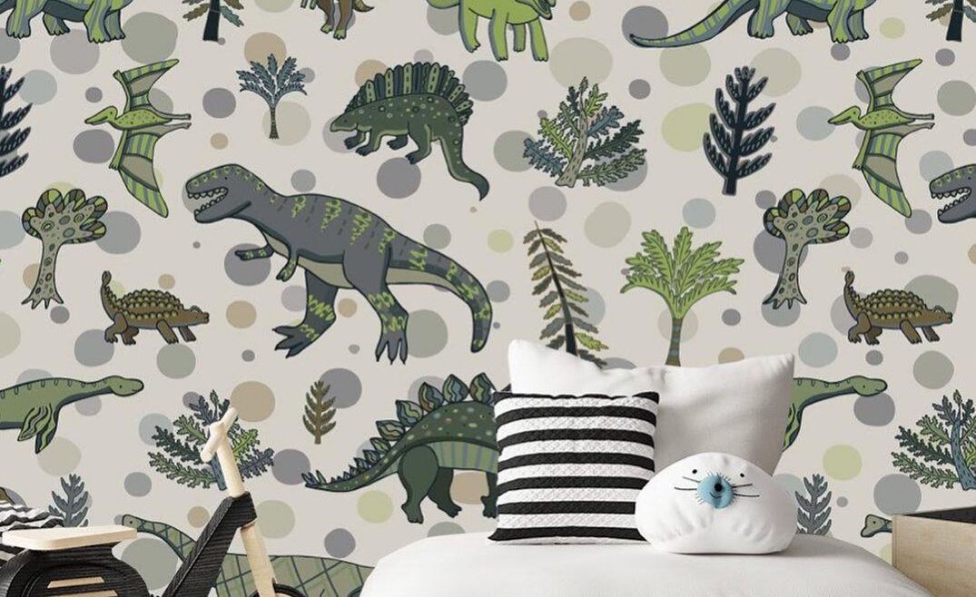
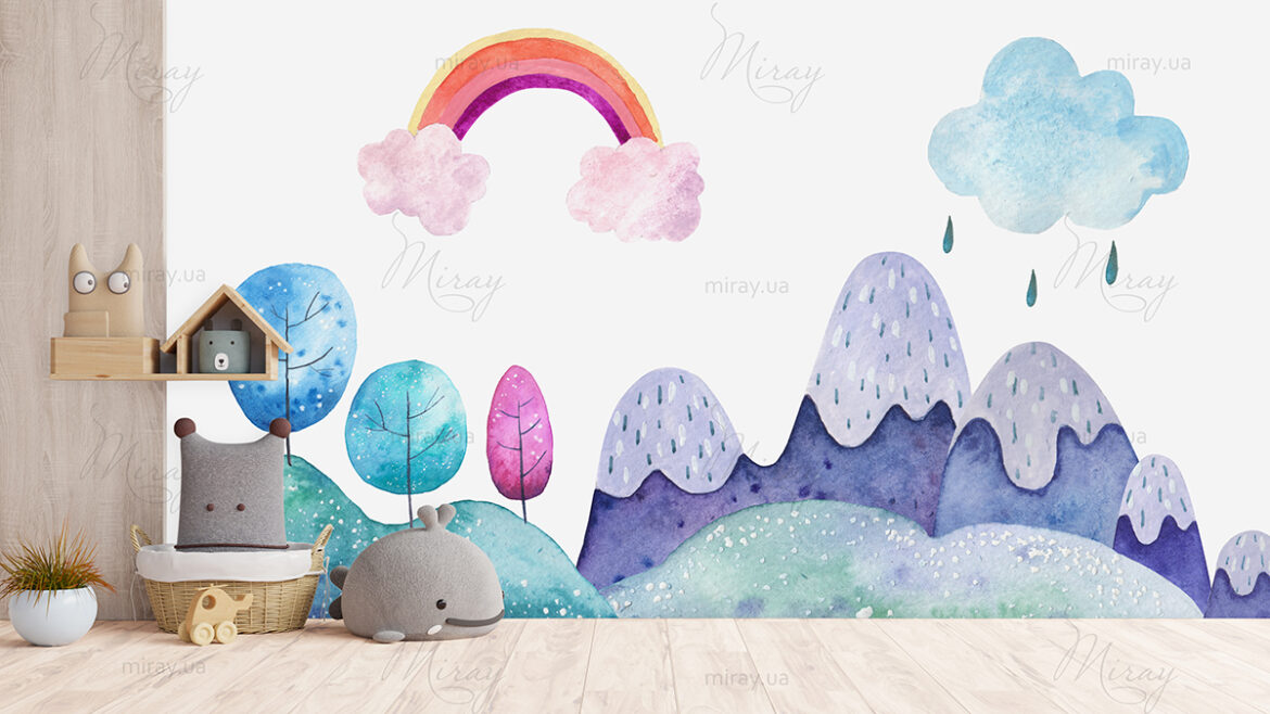
Children’s room
It is very important to properly arrange the nursery. As a rule, these rooms are done in warm pastel colors. But it’s best to pay attention to what colors children prefer. And it is this color scheme that will help the child develop better. Best to order photomurals for the children’s room which can be of any color scheme, solutions and fantasies.
As practice shows, children prefer blue shades of color … This will contribute to a harmonious rest after the child’s active pastime throughout the day. The same can be said for the color green, which has an incredible ability to remove anxiety and tension. Apricot and peach colors give an exceptional sense of security, as this is the color that babies get used to while in the womb.
Shades of orange, yellow and red give the room of the nursery real life-giving impulses. A great option would be yellow curtains that give a sunny atmosphere. In addition, the bright environment gives the child an additional incentive to learn.
Pink is only suitable for the smallest children. But brown can save children from fears and nightmares. However, instead of finishing the entire room in brown, it is best to place only a few elements here. This is important because a significant predominance of brown can adversely affect children’s creativity.
Kitchen decoration
For the kitchen, it is imperative to choose a color that will be conducive to eating. The ceiling should be done in soothing colors, and the environment in green, orange or red. Plates, dishes or a tablecloth, contrary to fashion trends, it is best to choose a white color that stimulates the appetite. We recommend paying attention to wallpaper for kitchen which today are a brilliant solution.
Do not be afraid to use wood, burnt brick or natural materials such as stone. It is best to avoid gray tones when painting floors or walls. You can also do without varnished surfaces. And the blue color is completely superfluous, although some of it will not hurt. Also purple will not work. But orange and green colors are more appropriate for catering chains.
Lighting and decoration of the kitchen area deserves special attention. Lighting should be as favorable and soft as possible. But fluorescent options are best left aside. You can decorate in any way, but exclude luxury items.
Now about the dishes. Orange plates and napkins should be used with your daily meals – they are very appetizing. But white dishes are perfect for various kinds of colored tablecloths. Conversely, colored tableware looks perfect on a white tablecloth.
Bathroom
The bathroom should embody cleanliness and order, hygiene and health. And here you can give free rein when choosing a color scheme, since during water procedures, our main goal is to freshen up, as well as relieve fatigue, regardless of the time of day. For example, shades of yellow can create the best ambience.
It is best to hang the towels the brightest. Blue and orange are perfect. Gray would not be so appropriate. By the way, it is the light colors that can expand the space, but which ones are no longer so important.
All this applies not only to the walls, but also to the rest of the bathroom interior. You can decorate the room with a wide variety of accessories.